David Altmejd – Heads

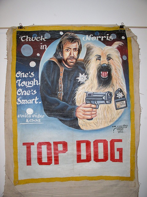
Recently I have been planning to move slightly away from painting and move onto 3D art. I want to make sculptures of my uncle’s head (mentioned before in my previous post about ‘poster style painting’) and paint/decorate his face and make him look like he has painted his face like various ‘pop figures’. So, figures you may recognize from films, books, tv etc.

I want to start with spiderman and darth maul and see how I feel, I really want to make work about Uncle as he is a family member who instilled a lot of memories for me as a child. He used to try and scare me (from a loving place) and succeeded, and it is this childish fear that I want to address in my work… Children have nightmares about the boogie man, creatures and characters that have been invented in the Western world that are instilled in our imaginations and memories.

I am interested to see what will come of this idea of repetition, using the same face to do different things.

David Altmejd is a Canadian Actor who works heavily in mixed media. He has an interest for objects that grow and decay, things that represent life and death. Crystals can often be seen in his sculptures. Amongst a lot of sculpture work, in 2014 he made a series of heads  that have been decorated/collaged with various materials, playing with hard and soft looking textures. They all look somewhat life like and ominous. Below is a piece titledSarah Altmejd’  2003, based on his sisters’ head, Altmejd considers her a loved one who loosely represents himself. This piece looks violant and somewhat bitter or despairing which is an interesting contrast with the actual subject matter.

altmejd1

Here are some other heads he made. Most are displayed on poles to be eye level and therefore more personal, however some look like they have been kicked into a corner on the ground, Altmejd calls these ‘rabbit holes’ because they each have a gaping hole which goes right to the ground.

altmejd4 altmejd2

altmejd5

altmejd6altmejd 3


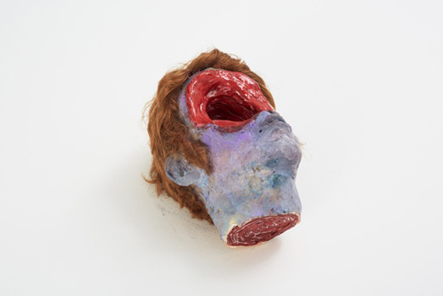
These last two are based on Altmejd ‘making a mistake.’ He once flipped a head over and realised another face emerged from the eyes upside down. He began to make sculpted heads that had two identities. The one to the left has a strange contrasting of one half being realistic the other being cartoony. The one on the right has two expressions, one smug and the other terrified.

I very much would like to recreate the sense of life there is in these faces in my own. I am looking forward to this new idea of using heads as my canvases and having them to do whatever I want with.


Camille Bombois – ‘Naive Artist’

I have recently been reading about Naive art – artists who had no professional training, usually because they could not afford it. Camille Bombois has a style that has really caught my eye, as it very much reminds me of Peter Blake’s work: they both share a plasticky looking painting style. It is however, a lot simpler than Blake’s work; it has a certain childish blockiness and simplicity to it.

bombois1

‘Les bas noirs avec journal’ (Black Stockings and Newspaper) 1930

I particularly like a collection of paintings Bombois made of his time working at the circus – Bombois longed to live in Paris to focus on his art, so eventually he moved there and got a job as a wrestler/strong man at fairgrounds to support himself. It is cear that this theme stayed strong throughout Bombois’ career.

bombois5

What I find most exciting about his clown paintings is how he has captured each individual clown and made it look like that is who they really are, rather than just a person dressed as a clown. For example, in the painting below the clown’s hand is looking slightly bent out of shape, this could be just a silly glove he is wearing but it looks like that is just the way his hand looks. He made the unnatural look natural.

bombois4

He also seems like he used to have an affinity with the colour green. Personally, I struggle to get the colour green to look any good, Bombois has used it it a way so it allows any other bright colour stand out, especially the reds.

There’s something about the combination of his lack of training with the circus theme just just works tremendously. His portraits of clowns are quite scary. They’re just normal clowns, but they definitely highlight the reason why so many people are afraid of them.

bombois3 bombois6

What’s strange is that I have already included a Circus theme in my work.. perhaps I will take inspiration from Bombois and expand on it.

Ryszard Zamorski – Wroclaw, Poland

During my trip to Wroclaw in Poland I saw a lot of Religious art, things like cathedrals full of shrines and halls with amazing murals and ceiling paintings that looked like they went all the way up to heaven. I felt totally out of depth with how serious Christianity is over there, much more so than the UK. My recent work has included the concept of deities; what it means to be worshiped and what it means to be a god of any kind.

It was amazing to see so many Cathedrals and historical buildings, but I wanted to see what Wroclaw had to offer in the ways of Fine Art. I discovered an artist named Ryszard Zamorski whose work was displayed in the National Museum. The piece that I viewed had a strange connection to the shrines and deities I had seen by that point.

Below are some photos I took of his work titled ‘Playboy’ 1977

20151121_145050 (1)

20151121_145040

20151121_14505520151121_145124

Zamorski studied at the State College of Fine Arts in Wroclaw, his work has a really individual style which seems to nod to Pop Art and pop culture (and Arte Povera, an Italian art movement which began in the 1960’s which made use of common materials in a hope to bring people away from the high commerce which drove the art world).

‘Playboy’ represents an obviously very confident and subversive character who is not only wearing denim but is made entirely of denim (which has been very simply painted). With Poland being under Communism it was a fabric very rarely seen, it would have had to have been bought in special stores or on the Black Market. His arrogant, sensual smile and casual stance is an obvious rebellion as he holds himself with so much importance. He also stood about 7/8 ft tall making him rather foreboding.

I felt attracted to his work immediately, it has a silliness mixed with attitude and sleaziness. It’s also rather creepy, the way some of the heads on the floor have been painted to look dusty, like past attempts or failed prototypes.

The bold colours and blocky sculpting style appeal to me because they look simple and almost childlike, and this is why they are so ominous. I truly felt their presence in the space they occupied, and I plan to make sculptures with a similar vibe.


Ghana Movie Posters

Keeping close to my theme of pop culture and recognizable figures I have also been reading about the movie posters that are made in Ghana.

ghana1

What I find so interesting about these paintings is that in certain areas they exhibit a rather high level of painterly skill. In some areas, (mainly in the faces and objects in the foreground) the colours are blended and toned so smoothly and clearly that they are in complete contrast with the rougher, less focused areas… It seems odd that there is only a certain amount of attention to detail in them.

ghana3

For instance, in the poster above, Jared Butler’s eyes are definitely wonky, and it totally amazes me that the artist was capable of creating the right texture and colour scheme for skin, had enough intuition to add shadow to certain needed areas, but was completely fine with leaving the eyes as they were. This is what gives these posters their illegitimate appearance that I like so much.

In the late 1980’s Ghana experienced a video feature film boom in which people from various different professions would set up their own film clubs, hire actors from TV or from the street and produced their own films. This is why a lot of these posters do not include actors names or the film makers involved, just the movie title, perhaps a hook or quip which relates to the film, and the film maker club. Not only would there have been very few people to actually mention for the making of these movies, therefore not really warranting their own credits, more likely it would have been awkward trying to get them all onto the page without distracting from the main scene. This lack of text is what really creates the ‘hand made’ look.

ghana2

When it came to painting posters for well known films, they are often incorrect, be it a typo or an image which has nothing to do with the film. A lot of the time the artist hadn’t actually seen the movie, just heard a brief description of the plot or perhaps only seen a couple of stills from it. Because of this these posters have a combined sense of humor, creepiness, eeriness and dreaminess.

Eventually, so it seemed, bigger films were being shown in these mobile film clubs. Reputable actors in big budget movies were being shown and therefore the posters began to include names, probably to grab more interest.

ghana4

These are just as laughable as the minor movies, perhaps even more so. There is something hilarious about seeing actors we all know from living in the Western world being painted to look so intense, almost maniacal, often with wonky features.

My aim has been to extract this unintentional warping of pop culture and make it purposeful in my work. So far I have done this with the characters SpiderMan and Darth Maul and I plan to do more.


Poster Style Paintings

I have completed two rather different paintings, each of which branched from the same areas of interest and inspiration; comics, pop culture, movie posters and memories. However, I believe they have very different reactions. For example, here was the first piece I completed of the two: Memory of a circus trip when I was little, spiderman was there to entertain the kids but really he was just plain scary. Apparently scary enough to make a movie about!

20151113_174158

This is a fairly large scale painting on wooden board. I wanted to recreate the slightly disproportionate, twisted style that is seen in movie posters from Ghana. However, I wanted to bring it to life by having spiderman’s hand coming out of the rectangle, as I have been really enjoying my current 3D theme.

I was also inspired the somewhat ambiguous writing that can be seen on Ghana movie posters. Sometimes there are symbols, or company names with typos, or just words that look random, but probably aren’t. I included a number I often come across (1:13) particularly on digital clocks. I have become intrigued by the Jungian theory of Synchronicity; that random phenomena can have a spiritual connection with people, and no matter how pointless it is, it seems to keep popping up in our lives (much like spider man for me). I like the subtlety of including this number in my work, almost like having my own mysterious sigil to sign my paintings off with.

Here is my most recent painting, which is very small (18cm – 13cm) again brandishing the numbers 1:13.

20151204_203201

This piece represents my childhood association between my uncle (who always used to try and scare me) and Darth Maul. We were on a train going somewhere on a family holiday and he was reading a magazine with Darth Maul on the front cover and for some reason I could see a resemblance between them. That is where the idea for a magazine came from, it also has a very similar layout as a poster and has more imagery to play with, such as barcodes and side-stories. I’d like to make more of these, continuing this subtle use of collage.

I wanted to return to the idea of making art that looked ‘not quite legit‘, as in ‘dodgy’ or untrustworthy (much like the Ghana movie posters). I was also interested in painting a memory of mine in the form of a magazine cover but with the same amusing strangeness of Ghana posters, I wanted to create a similar un-trustworthiness. For example, it seems as though it is meant to appeal to children (referring back to my own childhood) as it says FREE TOY, but the free toy is in fact a Star Wars bottle opener. It also does not look as smooth and slick as a normal Star Wars poster, it looks like it has more personal illustrative intentions than a normal magazine.

Peter Blake – His influence on my painting technique

From painting images of Spiderman I have recognized this interest I have with Pop figures and the way they are hard-wired into our understanding of every day life. Seeing Spiderman pop up and therefore becoming a normal part of my every day life is an example of westernization.

I also enjoy putting a strange twist on these images; taking something we accept as normal and making it look other worldly. Peter Blake mixes pop culture with reality and fantasy and has therefore become a huge inspiration for me.

The-Beatles-1962-by-Sir-Peter-Blake Peter Blake, ‘The Beatles 1962′ Screen Print

This particular piece caught my eye because of how Blake painted George Harrison’s face (bottom right). They all have this strange unnatural orange covering their skin like a mask, but Harrison’s features have been almost completely blurred out. This is a choice that almost seems completely pointless which is why it’s so intriguing; what was the reason for doing that? Either way, it looks spooky, like a ‘missing’ poster that’s wearing away. I decided to steal that idea and add it to my own set of skills.

20151112_172348

(Work most definitely in progress) I wanted spiderman’s face to not only be pushed back but distorted in a similar way to George Harrisons’. I darkened it against the light shade in his hand. I feel as though it would be pointless to portray spiderman completely crisp and clear as you can already tell who it is, you don’t need lots of detail. Perhaps that was Blake’s reasoning…