Peter Blake -Painting Style

A few years ago I saw this painting in the Tate Britain:

peter-blake

Peter Blake ‘The Owl and the Pussycat’ 1983

This highly stimulating visualisation of this well known poem has been stained in my memory ever since. I loved the flatness of the images, which look all cut and pasted together from different sources. I was also fascinated with the fact that this artist was clearly a very capable painter, yet chose to simplify some areas and make them 2D and cartoony anyway.

Throughout this year I have been studying his paintings/prints of people. I have been referencing him since I was painting Spiderman earlier on this year, and perhaps without his inspiration I would not have moved on to make my portraits which I consider to be very successful.

Through trying to copy Blake’s style I have actually found my own. I have chosen not to distort my portraits as much as he did because I felt that would take away from my original idea/concept. However, certain subtle techniques have certainly edged their way into my own style, for example: adding a glint of white to a person’s lips or eyes makes them look a lot more humanA lot more natural. Here are some examples of Blake doing this:

He has certainly remained one of my biggest influences throughout this year and I have learned a lot from scrutinizing his paintings whilst trying to gauge his painting style. It has been a frustrating process trying to show his influence in my work, to make it clear for others to see, but now at the end of the year I realise it doesn’t matter, as he was the reason I decided to make portraits of my own anyway.

Francis Bacon – Self Portraits

Although I have always been mesmerized by Bacon’s painting style and warped representations of reality, I have never intended to reference him as an inspirational artist because it seemed too obvious, as his work is so widely known among artists and admired by painters. Despite my own admiration for Bacon’s work I thought I should be looking a bit deeper, that is until I began making my own self portraits and realised everything I wanted to convey correlated with Bacon’s work; both the aesthetic and mental components of it.

A while ago I saw one of Bacon’s self portraits in the Cardiff National Museum, not looking for his work particularly. However, I felt I had to photograph this piece because of it’s composition, the way the flesh seems to squirm, the abstracted form and the colour relationships, all piled into what Bacon considered appropriate for a self portrait, representing the heavy emotions he carried throughtout his life.

20151011_155900

Francis Bacon (1909-1992) ‘Study for self-portrait’ 1963, Oil on canvas

Self taken photograph.

Almost subconsciously I chose to incorporate a lot of his signature images into my own work, such as the boxed off, claustrophobic ‘square’ format (below, for example), the use of flat, obscure backgrounds, and the less commonly used diptych layout (second to the more popular ‘triptych’).

f-bacon-pope-1

Francis Bacon ‘Pope 1 = Study After Velazquez Pope Innocent X’ 1951, Oil on canvas

The figure is lightly bordered off by a chalky white line, despite it’s light application it carries so much meaning and changes the feeling of the painting completely.

20160130_164601

The right section of my first painting shows how the facepaint was being wiped away, and it somehow looks as though my skin is being wiped away with it, or being moved around grotesquely. I applied the paint quite loosely here, ending up with a more ‘painterly’ style. There is movement in there that can be seen in Bacon’s portraits, but perhaps in a more subtle way. There is also a similar sadness in there, whilst Bacon’s work is known for being emotionally charged, he somewhat concealed the sadness and isolation in his paintings with angry, revolting imagery that immediately comes off as frightening.

Study_for_a_Self-portrait—Triptych,_1985–86

Francis Bacon, ‘Study for a self-portrait – Triptych’ 1985-86) Oil on canvas.

Having a troubled upbringing  whilst finding his identity and his obvious homosexuality (something his father resentedand despised, creating a negative relationship between himsef and his son) his work was already plagued with negativity. However, following the suicide of his lover George Dyer in 1971 (during that time Bacon was also dealing with the deaths of other close friends and his childhood Nanny) he was shaken from the experience and his work was ultimately taken over by it. Death and time passing became Bacon’s somber new theme, which is the basis of the triptych above, evidently lonely and bleak.

I have acknowleged my work is similarly personal and unfortunate to Bacon’s. Titled ‘Hypochondria’ my work represents the sadness of phobias and the control they have over people, using my own phobias to do this. Phobias create unhealthy habits of avoidance, repetative negative thinking, illogical feelings of fear and isolation, because one believes these feelings cannot be helped. Having dealt with various kinds of experiences like this myself, I thought the most raw and honest way to conduct this would be to base it on my own fears. So Bacon’s self portraits in particular are what have inspired me the most for the way he held importance on his own identity as well as his sitters. 

Latest Paintings – Technique

Through making all these different paintings I have somewhat developed my own style and have learned how to apply the different skills I have acquired over my three years of uni in useful ways. For example:

In my first painting I knew I wanted to make one side dark and one side light, simply to see what affect it would have on the overall feeling of the two portraits. Inspired by the idea I picked up in Poland back in November, I wanted to make multiple paintings in one, so one canvas but two paintings, with a shameless line down the middle. I saw this in many old religious paintings of scenes from the Bible, so the line created a kind of ‘story board’ look. Below are a couple of chapels I visited which contained these sorts of paintings, unfortunately I have lost a great deal of photographs through technical difficulties and can not show as many as I would like:

I loved the seriousness of the paintings but also the roughness of the dividing line between them, which began my journey with these large paintings of mine.

20160130_164552

The left side is much softer, particularly in the hair, whilst the right side is a lot more dry and scratchy looking, showing discomfort. The left side is much more eerie than the right, which is ironic because it is the lighter side. Although the portrait on the right is dark and has a ghostly tint to the flesh, it looks more vulnerable and innocent than it does spooky.

I kept this in mind for my last painting:

WP_20160506_08_48_56_Pro

This time I think I managed to achieve a scary dark painting, with the one on the right looking still and innocent. I wanted the mouth face painting to immerge out of the darkness, so I painted everything on top of a very dark background. To create a sense of depth or the person being in a room I painting a poster that was present in the background so that I wasn’t simply floating in space. I thought it was necessary as the portrait on the left had a plain background, which I chose because I wanted the object to look as thought it was seated in a pose waiting to be painted. This looks purposeful and therefore a little bit less scary than the left painting, which looks like it is been hiding in the dark and the viewer has walked in to find it there staring back at them.

My least favorite painting:

WP_20160420_15_53_54_Pro

Although this painting has its good bits (i’m quite proud of the nose and mouth, for example) I just felt I had to move on from it because I started to waste time fretting over it. I believe I was less mindful whilst painting this one, most likely because I was so excited to do it I didn’t take the time to plan it out first. I didn’t pay enough attention to the lighting or stance, which are important elements of a painting that can easily go overlooked.

Whilst painting this image onto myself I literally felt repulsed at the idea of having ‘germs’ on my face, which is why I was so excited to paint it. I had a strange connection with this painting and wanted it to be central in my show, but I couldn’t help feeling dissapointed with it because it didn’t turn out as affective as i’d hoped and became frustrated with the idea of it being central to my entire degree show. I have since let this go, but I know if I had paid more attention to the lighting in particular, I would have felt more satisfied with this painting.

Degree Show Layout


I decided to exhibit 4 felt masks and 3 paintings inspired by these masks in the degree show. Here are the paintings with their matching masks in the order I intend to present them:

Spiderman mask – Claustrophobia

Meningitus cells under Microscope – Germophobia

Gaping Mouth – Sleep Apnea

Heart – Cardiophobia (fear of heart disease)

I have 3 walls and I think this will be a good amount of room to distribute my work in a way that doesn’t look too crowded, but also spacious enough to each be appreciated separately. One thing I am still unsure about (scarily close to the deadline) is wether I will title them individually so they make a bit more sense. I shall have to wait until they are up on the wall to see if they would benefit from having titles at all.

New New Painting – Spider mask

My latest creation was made from yet another face painting. I took the design from the first canvas mask I sewed earlier this year, where I was originally going for a ‘Luchador’ style.

20151013_14472220160223_180500

I enjoyed making my first ‘face painting’ painting so much that I decided to make another one. I had hit a brick wall and worried these were too literal, but I wanted to make something new and exciting, and I wanted to enjoy making it!

Here are some photos of my painting in progress…

And here it is very nearly finished; i’d perhaps like to add darker tones to the subtle hair…

20160226_170616

I am particularly excited by the layers I have made to create this sickly, unbearably luminous colour scheme. I am also proud of the textures I have created; some slimy, some rough and dry, some shiny etc.

I am still interested in this idea of Spiderman having part of my identity, but now I want to marry it with portraiture in a kind of comic bookish style, hence the bright colours and dramatic rectangular format. 

New painting – John Stezaker

I have recently completed another painting which took me slightly longer than my last one as I came to a lot of difficulty and unsurities. Here it is finished.

20160218_140500

This collaged idea came from my research on John Stezaker.

Using the same format as the last painting (having two in one) only with a slight twist. I went with this idea of defragmentation of the features to create a glitchy affect. Personally, I aimed to create a sense of panic and claustrophobia in this painting, hence the separation of the eyes. These were inspired by the plaster masks I made whilst creating alganate molds of my face. They represented the hard shell which enclosed my face and made me feel so uncomfortable. I liked the duality of one mask allowing my mouth freedom and the other my eyes, as I could not do both at the same time.

I see them as painted collages, as there is a faint image of spiderman’s symbol where my eye should be – spiderman being my own symbol for fear. Below are some photos of my painting in progress.

I didn’t like the rectangular eyes section looking so realistically painted as it didn’t add any other dynamic to the painting, and the running of the paint was too graphic and brash for my liking, so I simplified it and made it look comicy.

20160210_114249

I much prefer it like this. Still unsettling but in a less obvious way.

I wanted the left eye to look wrong somehow, so I took inspiration from Peter Blake’s ‘Tarzan, Jane, Boy and Cheetah’ (1966-75) for obvious reasons (wonky eye on man).

Peter Blake Tarzan, Jane, Boy en Cheeta - 1966-1975


Face Painting

I decided with this new turn in my work in which I include myself more, I should literally use my face as a canvas. I decided to drive away the literal illustration of Spiderman but rather, leave an impression of his identity as a rather sinister superhero on my own features to represent my anxieties.

I wanted to paint my face inspired by the neatly obsessive and linear marks I make when i’m sewing, then I would photograph it, paint from it and perhaps go round again. I just love working in this way; having the actual artefact and then a painting of the object right next to it. This came from my love of Peter Blake who collages toys onto paintings inspired by those toys.

20160119_233836

Photo of me with finished face paint

After taking multiple photos of myself in different angles and lightings, I chose my favorites. What was interesting was when i started removing the makeup; it had an oddly human appearance in contrast with the finished makeup. I instantly knew I wanted to make a double sided painting.

Some photo’s of my painting in progress…

20160130_164552

Finished portraits before and after

I painted the one on the right with bright colours to capture the brightly lit photograph I had painted it from. Much the same with the one on the right, which was taken in the dark instead. I’m really happy with them both, but if I stare too long I start to see flaws and I would rather work on something new. The imperfections are almost beneficial, I think…. more interesting and expressive.

Everyone has commented on the eyes, how they draw you in. I find this surprising as i wasn’t actively aiming to make the eyes particularly alluring or lifelike, I think i just captured the sadly human and painful look of the flesh around the eyes which can be seen in the photographs anyway. I plan to make at least two more paintings this shape and size.

Dissertation PDP

With the relief of handing in my dissertation, I now get to write about writing my dissertation which is brilliant… actually, it is rather brilliant, I have time to reflect on this huge piece of writing I never would have made unless I came to university.

My title in short: ‘How does my Subconscious Affect my Work?’
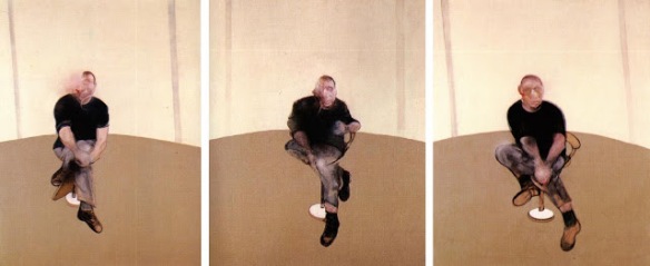
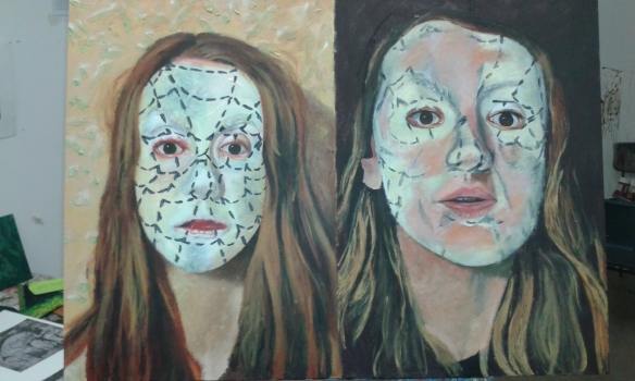
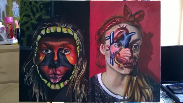
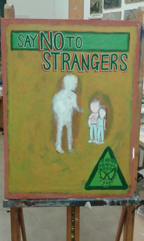
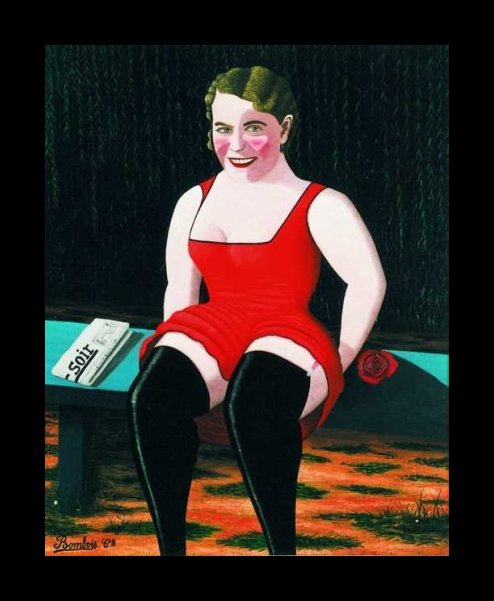
Below (My Artefact)

20150408_174544

Strengths:

I believe I created a unique body of writing which included good ideas and interesting points. I was also rather uncareful when it came to the whole use of the word “I” in my essay, but this was because my essay was quite personal and had a lot of relevance to my own artistic practise. Having chosen to write a 6000 word paper with an artefact, I couldn’t really have written my dissertation without using the word “I” and i don’t feel it hindered my essay in any way.

Flaws: 

I had a lot of difficulty making my self clear in my essay, I had so many different points to make and they would all have connections to each other but could not ‘sit next to each other’, meaning they would arrive in different chapters. This was the biggest problem I faced, as it made me freeze up in terror. I had all the words I wanted to say but they had to be separate, when all I wanted was one long paragraph with no pauses or full stops, just one perfect sentence which lasted 6000 words. Everything was in relation to each other and I had to find a way to make it both structured and flowing. After discussing that with Mahnaz, I decided to just use phrases such as “in relation to my previous chapter” etc. I couldn’t find many other ways around it.

My conclusion was also rather abrupt, I must admit that it wasn’t so much of a ‘finishing’ of my essay but rather ‘putting it out of it’s misery… knocking it on it’s head ready to be ground up into beef’. I felt an urge to just have it finished and handed in so I wouldn’t have to think about it anymore, simultaneously handing it in early and avoiding the stressful rush of other students doing the same. This way I could let it go and focus on my studio work, which I don’t regret. I’ve done what I can for my essay, stressing over the finalities wouldn’t get me much further.

Finally, I felt there was a lack of certainty in my writing. By the time I began to seriously write it (december), it was too late to start something new that I would have more confidence in writing. My decision was to do my best and work with what I did know, and I don’t think I did too badly. However, because of this lack of knowledge and dedication to my subject matter, I leaned more towards my own work and therefore my own opinions and thoughts on the matter of Surrealism, dreams, memories, symbolism, Jung etc. Overall, it was probably too personal.

What have I learned?

For any future essays, I must make sure it is something I can write about inside and out. As interested as I am in dreams and the psychology behind art, for some unexplainable reason I had no drive to write an essay about it. I didn’t know where to begin. As someone who finds it hard to articulate themself, I find it a lot easier to write an essay where I can find clear, borderline factual points to include. Dreams are such an esoteric and ethereal subject that it was really difficult to write a structured essay about it. Or perhaps it was only difficult for me. In hindsight I should have written about something else.


I felt we were made to write our proposals too soon, all the way back in second year, as I ended up writing about old work. I knew I wanted to write about painting, and what I was painting back then was dreams, and as far as I knew, I was going to continue in that direction through to 3rd year. This was probably the root of all the problems I faced, if I put it bluntly.


Funny things I have learned from doing my dissertation:

I originally intended to write lots and lots about Surrealism, but through lack of any real enthusiasm, I neglected to do the research. I was only ever interested in Dali, he has always fascianted me. He had a way with the language of painting that, in my opinion, no other Surrealists could achieve. A particular humour and darkness about him which had such a charming quality which showed through his work. I’ve learned how attracted I am to his work just by noticing how I neglected to discuss all the other members of the Surrealist movement. This is a definite flaw in my essay, but I realised that my interest in Dali over shadowed my interest in Surrealism, and I felt this was more important.

I also learned how personal dream analysis is. I dove into my essay expecting to be overrun with theory after theory on the subject, facts about symbols and their meaning in dreams. Instead, I found through my reseacrh of Jung, that dream analysis is a very sensitive subject and Jung aimed not to pigeon hole the individual involved. Dreams are simply superimposed images and memories and in order to find any meaning all one has to do is pull the important bits out and note the feelings they felt whilst experiencing the dream. It’s really quite simple, more simple than I had imagined.

As odd as it sounds, writing my dissertation taught me to respect my work. I never gave my paintings titles until I had to reference myself in my essay, and this was an eye-opener for me. I realised the strength in my work and this has taught me to treat every artistic endeavor as if I was going to reference it in an essay.


SAY NO TO STRANGERS

My latest painting (work in progress) relates to a sign located in Portland, south Dorset, and very near the sea. I go there with my family every year as something of a tradition and this sign haunts me every time I see it. Below is my most recent photograph of it.

20150822_160550

I find this sign so creepy because of how quiet the area is, also, there are no other signs around, just this one. It marks the beginning of a long downward walk into a small cove hidden in the rocks which attracts a small number of tourists.

With the way the salty wind has whipped away it’s paint over the years, it looks like it is too late to give warning; the children’s featureless balloon-faces make me think they have already been swept away by some sinister, anonymous figure, never to be seen again.

20151203_173651

I chose to work on a dicarded canvas pre-made by someone from the studio (unknown), because I liked it’s anonymity and it’s warped shape and grubby markings. Also, the dark-salmon colour made for the perfect base coat, as it is a colour that is ironically soft and childlike for this particular painting. I chose to put greens and yellows over the top as they seem to make the salmon colour really pop in this strange, sickly and repulsive kind of way. I added stabs of red to the lettering to confirm the hidden warning and urgency of the piece.

Spiderman has been put in the ‘sign’ shape to re-affirm the warning sign idea. He looks somewhat like a neighborhood watch symbol, but one cannot tell if he is the good guy or the bad guy. My previous work would suggest he is the bad guy, but it is still ambiguous. Ambiguity is something I must be careful with over doing in order to avoid my work becoming – for lack of a better word – meaningless…?

So far I have decided to keep going with this language of symbols I am slowly creating in my work, as this will strengthen it and show a correlation.


Camille Bombois – ‘Naive Artist’

I have recently been reading about Naive art – artists who had no professional training, usually because they could not afford it. Camille Bombois has a style that has really caught my eye, as it very much reminds me of Peter Blake’s work: they both share a plasticky looking painting style. It is however, a lot simpler than Blake’s work; it has a certain childish blockiness and simplicity to it.

bombois1

‘Les bas noirs avec journal’ (Black Stockings and Newspaper) 1930

I particularly like a collection of paintings Bombois made of his time working at the circus – Bombois longed to live in Paris to focus on his art, so eventually he moved there and got a job as a wrestler/strong man at fairgrounds to support himself. It is cear that this theme stayed strong throughout Bombois’ career.

bombois5

What I find most exciting about his clown paintings is how he has captured each individual clown and made it look like that is who they really are, rather than just a person dressed as a clown. For example, in the painting below the clown’s hand is looking slightly bent out of shape, this could be just a silly glove he is wearing but it looks like that is just the way his hand looks. He made the unnatural look natural.

bombois4

He also seems like he used to have an affinity with the colour green. Personally, I struggle to get the colour green to look any good, Bombois has used it it a way so it allows any other bright colour stand out, especially the reds.

There’s something about the combination of his lack of training with the circus theme just just works tremendously. His portraits of clowns are quite scary. They’re just normal clowns, but they definitely highlight the reason why so many people are afraid of them.

bombois3 bombois6

What’s strange is that I have already included a Circus theme in my work.. perhaps I will take inspiration from Bombois and expand on it.