


I have finally completed my final piece to a standard which I think to to be suitable for the assessment. There are some areas that I am still unsure about and I still find it slightly boring. However, I could choose to work on my paintings nonstop and never truly believe they are finished, there will always be areas which I would be unhappy with. Overall, I am happy with the outcome. Throughout my entire City project I have stuck to pastel, baby colours to keep in with my child-like theme. Therefore, the crossover of childish innocence in my work to the darker elements of the city has resulted in a more powerful, intimidating piece in which the colours are brash and saturated and the shadows are dark and dramatic.
I also think using a hot colour pallet was the correct choice as it stands out from the other works I have made. It is also what gives the piece it’s sinister feeling and therefore confirms the overall message I was trying to convey throughout this project.
Here are some of the changes I made which I felt enhanced my piece a bit more, I darkened the lower left grey building as I thought there needed to be more of a contrast and I stencilled in some more lettering, this time making them less hidden than the first one.

I still felt dissatisfied with it and knew I needed to make some further changes. Here is how it looks finished.

All I really did was fill in the post on the left a bright orange to match the subtle orange of the lettering. I believe it now looks finished in a way that encompasses my techniques demonstrated so far in this project along with my ideas and research. I am happy with the stencilled lettering, particularly as they don’t make complete sense. I like this element of mystery. I also like my use of yellow (inspired by James Jessop), the way I have made it the backdrop of the composition and used hints of it within the buildings, it accompanies the violent red and emphasises the cool blues and greys. I chose my colours carefully.
I have always been unsure about the grey building on the lower left. I have wanted to keep some of the flat, blocky style I used at the beginning of this project present in all my pieces, despite how they vary. Therefore I have been reluctant to add more detail to that area and keep the roof abnormally bright as I liked this unreal element.
I also encorporated some of the techniques I learnt in the group painting sessions we had with James. Instead of painting completely flat block colours, I made layers. This can be seen subtly in the red buildings where I ‘skuffled’ or ‘dry brushed’ the bright red over the dark red. This technique came in handy when I wanted to change a certain colour as I think this use of layers makes my piece more interesting than simple flat colours, especially as it is only subtle.
I have embraced painting as my dominant medium for this project and have been continuing to paint throughout. Here is one of my paintings at it’s starting point. It is painted on a very small chunk of MDF board and by this point it was made up of blocks of colour.

Below is my painting in it’s second stage when I began to add different colours and textures to bring it to life.

And below is the finished version of my small painting.

Much like my the first painting of my series, it has an unhealthy orange glow. Along with the various marks I made to give it more life and character, the orange shading hanging over the blocks looks like some kind of toxic sludge, this is exactly what I intended it to look like. I think the contrast in the lightness of the orange with the dark shading at the bottom affectively centres the painting and emphasises the detail of the blocks in the middle.
Here is my final piece (unfinished)

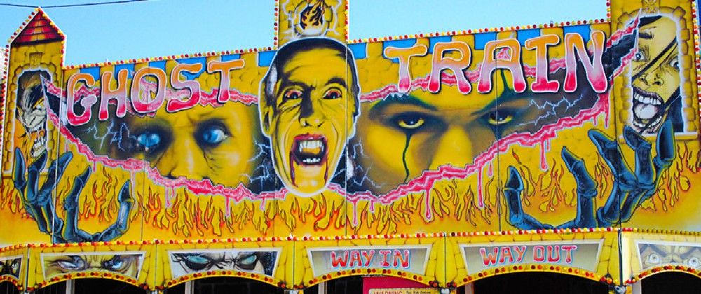
Based on my favorite compostion from my entire project, I (once again) took inspiration from James Jessop, specifically his ‘Horror’ train painting (below).

The sickly unnatural yellow of the sky clashes with the reds and browns of the buildings below, and I think this contrast is what makes this painting so terrifying. I wanted to experiment with these colours in my final piece to see if I could recreate this feeling of terror I feel when I imagine myself in Jessop’s painting.
I stencilled the word ‘CAUTION’ near the top of my painting, only faintly visible so it wouldn’t be too loud, I liked the idea of keeping it hidden. This technique was extracted from Ben Eine’s works on the streets of London.
So far I think my painting is rather boring. I think the stencil helped bring it to life, so perhaps another stencil woud work…? My initial aim is to make my painting just as terrifying (if not more so) as Jessop’s painting as my entire project has been based on my feelings toward the city, mainly overwhelmed and wary. Perhaps it could improve with some graffiti? Or a colour change in some areas? Either way I need to both change and add something in order to call my painting finished.
I decided to continue my large cutout painting incorporating my idea of text and graffiti into it. It has gotten me thinking about what it means to be a graffiti artist, whether it is the style the artist chooses or the context. I came to the conclusion that I most certainly am not a graffiti artist, or atleast not a street artist anyway, especially as I am essentially recycling other people’s artwork which I have spotted on the street. I believe it is the anonymity of the artwork which makes it graffiti, the intention to avoid getting caught whilst making one’s statement is what makes one a graffiti artist. However, it can be viewed differently by everyone.
Here are some snippets of graffiti I photographed and translated into my painting.


I have also collaged a caveman/neanderthal type character onto one of the houses, inspired by old horror movie/Ghana posters. By doing this I was trying to create a sense of melodrama. However, now I think I need to expand this.

Above is my collaged caveman. My intention was to decorate these plain buildings in a way which combined fantasy with reality, therefore I did not just want to cover them in graffiti. Inspired by the works of James Jessop (whose paintings are filled with drama and bold colours) I decided to add a caveman to my piece in an attempt to represent an old horror movie. I am happy with the way he looks rubbed away as it looks very similar to old bilboard posters when they have been worn away by the rain and started to peel off. However, I don’t think he stands out enough, meaning i’m not quite sure one could tell what it is meant to be. I think he looks a bit lost.

Intending to balance out the randomness of the caveman I added another dramatic horror movie image: octopuss tentacles. However, this time I painted it to look like graffiti rather than a poster. I am really happy with the look of it, mainly for the luminous colours matching the colour scheme of the other graffiti, I think these colours somewhat emphasise the silliness and quirkiness of the piece. Against the blue underlayer these colours really stand out.

Here it is now, what I consider to be finished, atleast until I notice something I dislike about it that niggles at me and makes me change it…
