I decided to continue my large cutout painting incorporating my idea of text and graffiti into it. It has gotten me thinking about what it means to be a graffiti artist, whether it is the style the artist chooses or the context. I came to the conclusion that I most certainly am not a graffiti artist, or atleast not a street artist anyway, especially as I am essentially recycling other people’s artwork which I have spotted on the street. I believe it is the anonymity of the artwork which makes it graffiti, the intention to avoid getting caught whilst making one’s statement is what makes one a graffiti artist. However, it can be viewed differently by everyone.
Here are some snippets of graffiti I photographed and translated into my painting.


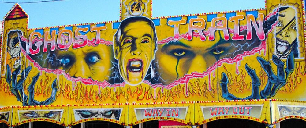
I have also collaged a caveman/neanderthal type character onto one of the houses, inspired by old horror movie/Ghana posters. By doing this I was trying to create a sense of melodrama. However, now I think I need to expand this.

Above is my collaged caveman. My intention was to decorate these plain buildings in a way which combined fantasy with reality, therefore I did not just want to cover them in graffiti. Inspired by the works of James Jessop (whose paintings are filled with drama and bold colours) I decided to add a caveman to my piece in an attempt to represent an old horror movie. I am happy with the way he looks rubbed away as it looks very similar to old bilboard posters when they have been worn away by the rain and started to peel off. However, I don’t think he stands out enough, meaning i’m not quite sure one could tell what it is meant to be. I think he looks a bit lost.

Intending to balance out the randomness of the caveman I added another dramatic horror movie image: octopuss tentacles. However, this time I painted it to look like graffiti rather than a poster. I am really happy with the look of it, mainly for the luminous colours matching the colour scheme of the other graffiti, I think these colours somewhat emphasise the silliness and quirkiness of the piece. Against the blue underlayer these colours really stand out.

Here it is now, what I consider to be finished, atleast until I notice something I dislike about it that niggles at me and makes me change it…
