Contextualization – City

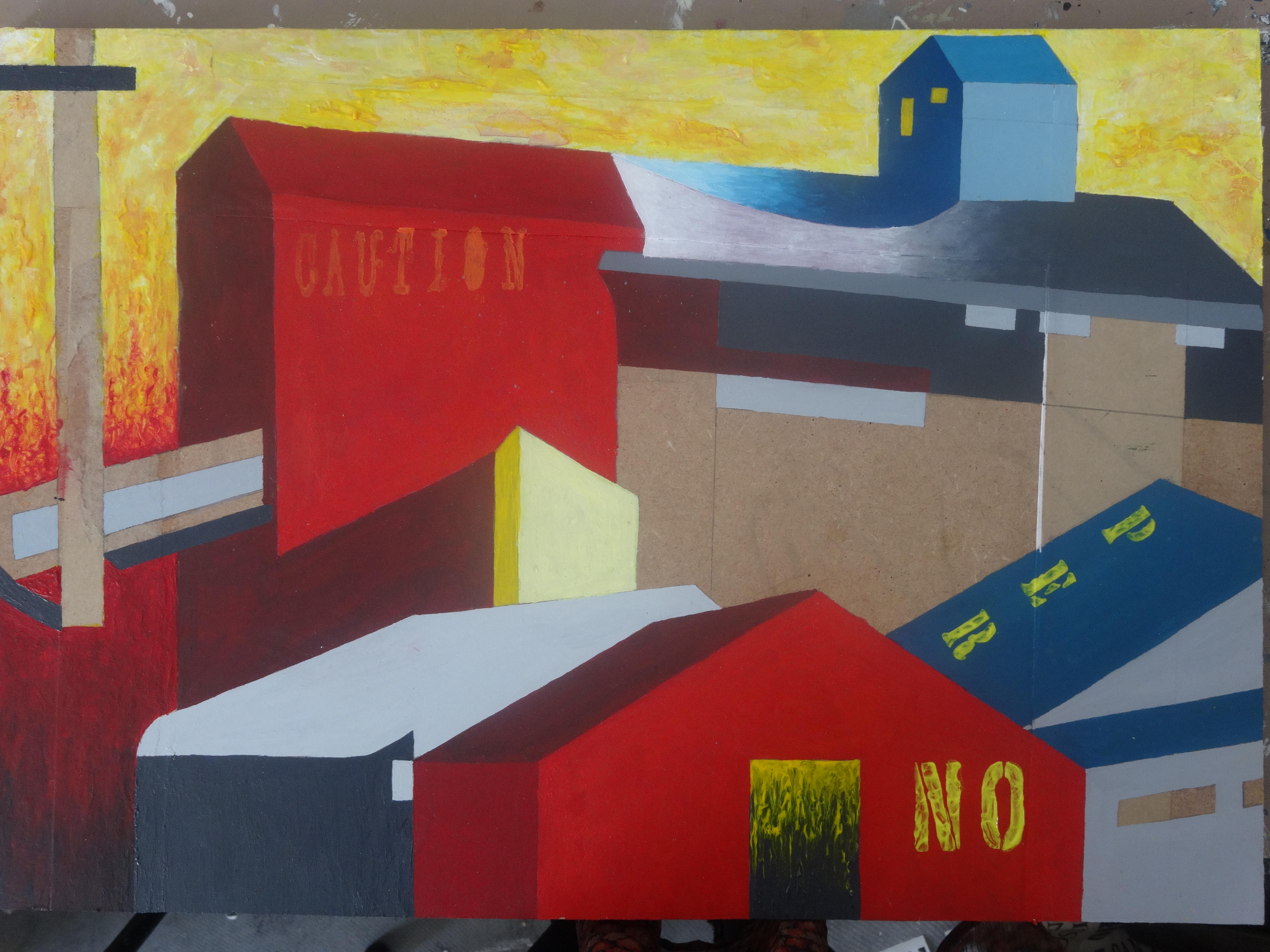
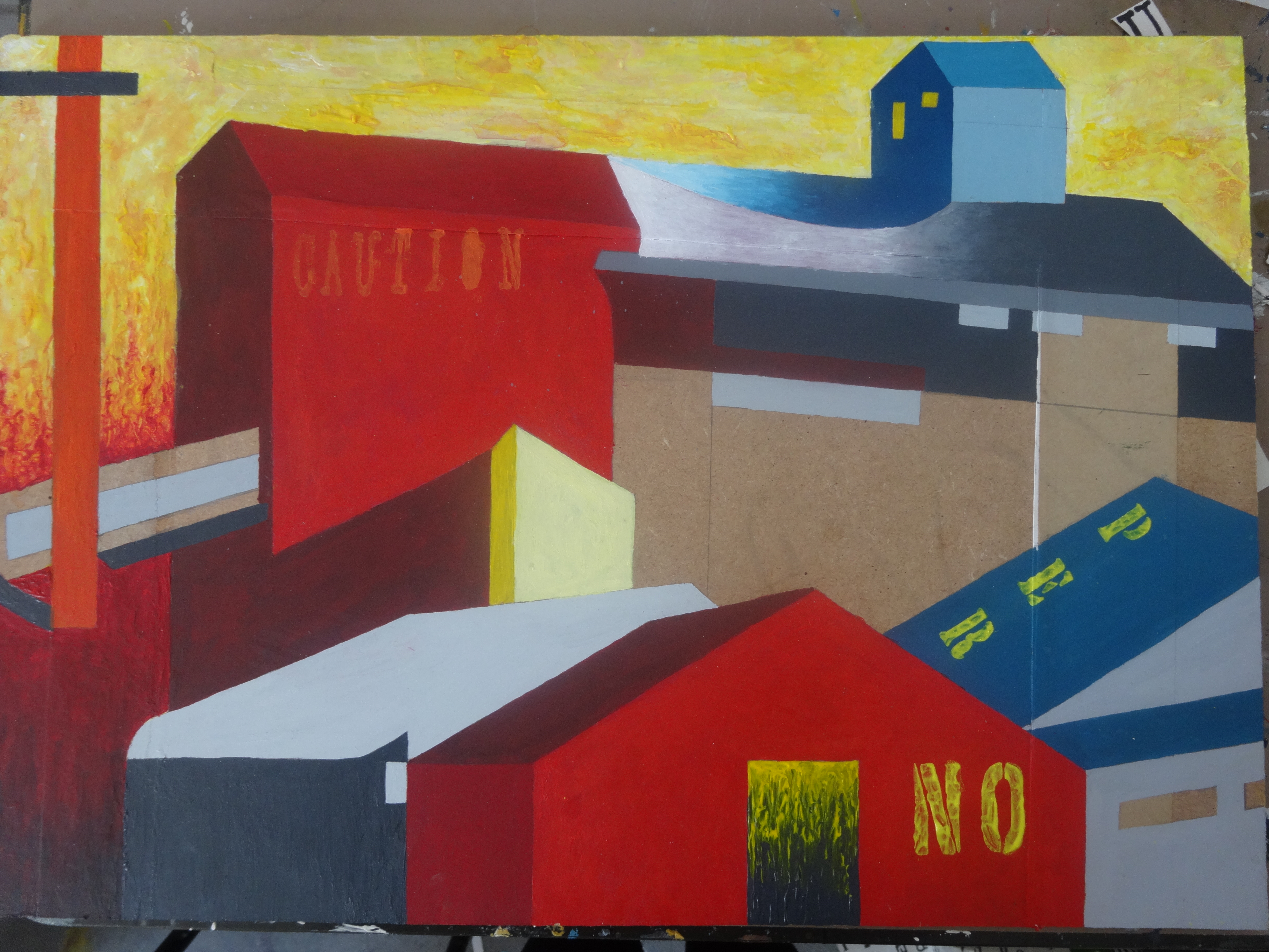
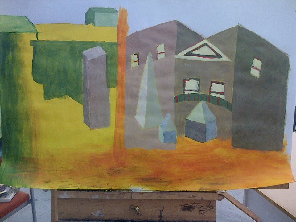
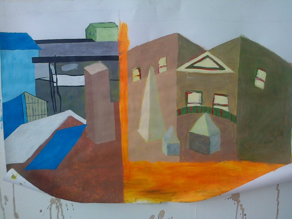
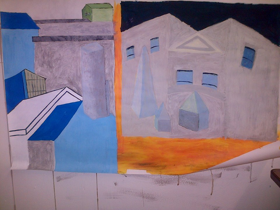
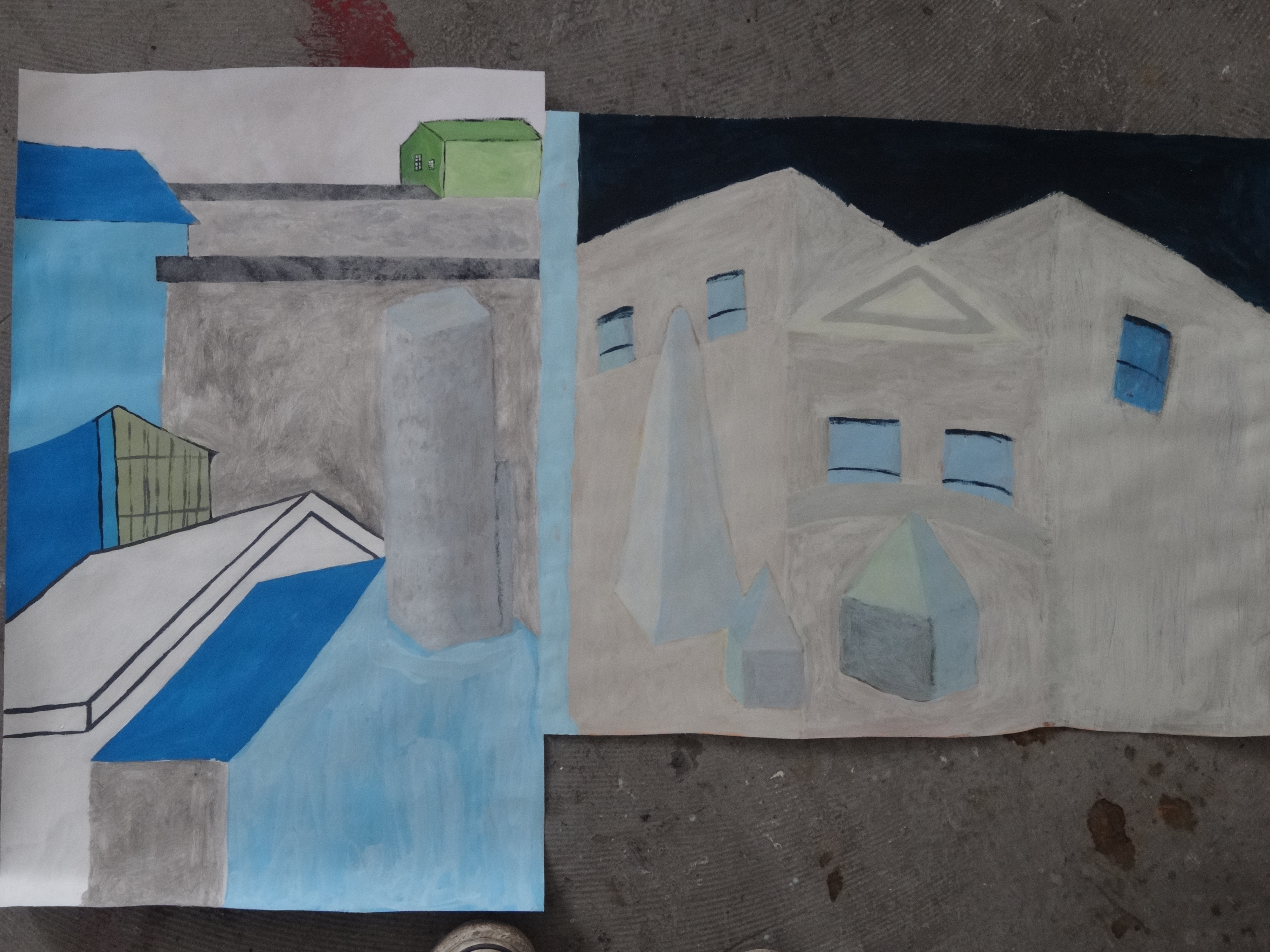
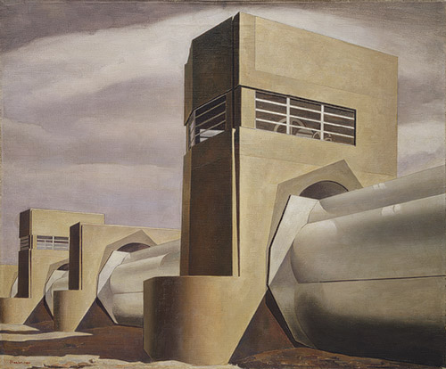
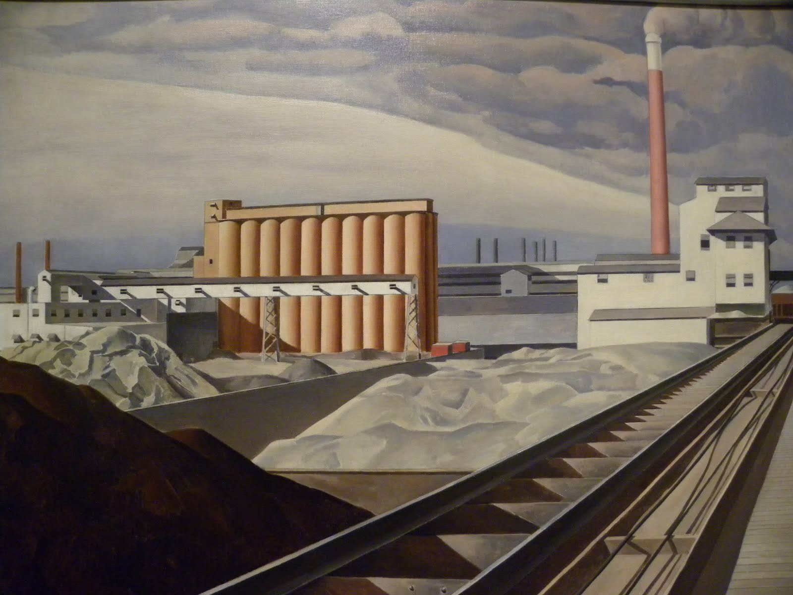
My first main influence for the city project (whose work continues to inspire me throughout) is Charles Sheeler, who was an American painter and commercial photographer from the early 20th century. He was one of the founders of Modernism and Precisionism and is known as one of the master photographers of the early 20th century. He painted many industrial landscapes such as traintracks, factories and other buildings. I find his sensitivity to colour, smooth paint application and choice of viewpoint very attractive and I can see much of my own style in his work, as I tend to be quite a perfectionist and enjoy working in controlled straight lines. His precise painting style was mostly influenced by his eye for photography, you can tell by the angles he chose to paint them from. Below are some of his works.

charles sheeler1charles sheeler2Charles-Sheeler3

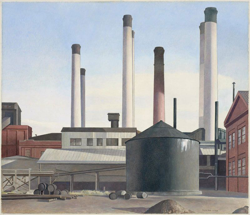
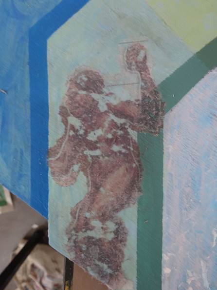
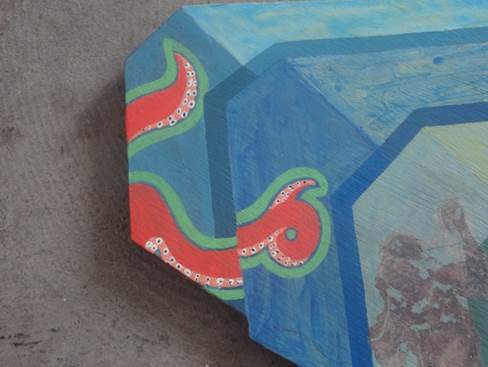
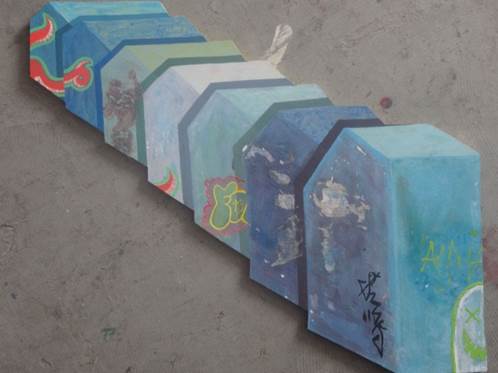
Another thing I find fascinating about Precisionism is how one can choose the correct colour of paint to match that of a photograph, one can paint it in the correct place according to the composition of the photograph, but the finished product will not always look like a genuine photograph. The quality of paint is different to the quality of a photograph, and although it is achievable – to paint in a photo-realistic way – but Sheeler managed to paint realistically without making the painting look like one could literally step into it. This is something that I have taken on board for my own work and have kept it in mind whilst I have been painting.

Field: Final Piece

I have finally completed my final piece to a standard which I think to to be suitable for the assessment. There are some areas that I am still unsure about and I still find it slightly boring. However, I could choose to work on my paintings nonstop and never truly believe they are finished, there will always be areas which I would be unhappy with. Overall, I am happy with the outcome. Throughout my entire City project I have stuck to pastel, baby colours to keep in with my child-like theme. Therefore, the crossover of childish innocence in my work to the darker elements of the city has resulted in a more powerful, intimidating piece in which the colours are brash and saturated and the shadows are dark and dramatic.

I also think using a hot colour pallet was the correct choice as it stands out from the other works I have made. It is also what gives the piece it’s sinister feeling and therefore confirms the overall message I was trying to convey throughout this project.

Here are some of the changes I made which I felt enhanced my piece a bit more, I darkened the lower left grey building as I thought there needed to be more of a contrast and I stencilled in some more lettering, this time making them less hidden than the first one.

Nearly finn

I still felt dissatisfied with it and knew I needed to make some further changes. Here is how it looks finished.

Fin

All I really did was fill in the post on the left a bright orange to match the subtle orange of the lettering. I believe it now looks finished in a way that encompasses my techniques demonstrated so far in this project along with my ideas and research. I am happy with the stencilled lettering, particularly as they don’t make complete sense. I like this element of mystery. I also like my use of yellow (inspired by James Jessop), the way I have made it the backdrop of the composition and used hints of it within the buildings, it accompanies the violent red and emphasises the cool blues and greys. I chose my colours carefully.

I have always been unsure about the grey building on the lower left. I have wanted to keep some of the flat, blocky style I used at the beginning of this project present in all my pieces, despite how they vary. Therefore I have been reluctant to add more detail to that area and keep the roof abnormally bright as I liked this unreal element.

I also encorporated some of the techniques I learnt in the group painting sessions we had  with James. Instead of painting completely flat block colours, I made layers. This can be seen subtly in the red buildings where I ‘skuffled’ or ‘dry brushed’ the bright red over the dark red. This technique came in handy when I wanted to change a certain colour as I think this use of layers makes my piece more interesting than simple flat colours, especially as it is only subtle.


Field – More Paintings/Final Piece

I have embraced painting as my dominant medium for this project and have been continuing to paint throughout. Here is one of my paintings at it’s starting point. It is painted on a very small chunk of MDF board and by this point it was made up of blocks of colour.

Picture8

Below is my painting in it’s second stage when I began to add different colours and textures to bring it to life.

Picture9

And below is the finished version of my small painting.

Picture10

Much like my the first painting of my series, it has an unhealthy orange glow. Along with the various marks I made to give it more life and character, the orange shading hanging over the blocks looks like some kind of toxic sludge, this is exactly what I intended it to look like. I think the contrast in the lightness of the orange with the dark shading at the bottom affectively centres the painting and emphasises the detail of the blocks in the middle.

Here is my final piece (unfinished)

Picture7

Based on my favorite compostion from my entire project, I (once again) took inspiration from James Jessop, specifically his ‘Horror’ train painting (below).

jessop-horror

The sickly unnatural yellow of the sky clashes with the reds and browns of the buildings below, and I think this contrast is what makes this painting so terrifying. I wanted to experiment with these colours in my final piece to see if I could recreate this feeling of terror I feel when I imagine myself in Jessop’s painting.

I stencilled the word ‘CAUTION’ near the top of my painting, only faintly visible so it wouldn’t be too loud, I liked the idea of keeping it hidden. This technique was extracted from Ben Eine’s works on the streets of London.

So far I think my painting is rather boring. I think the stencil helped bring it to life, so perhaps another stencil woud work…? My initial aim is to make my painting just as terrifying (if not more so) as Jessop’s painting as my entire project has been based on my feelings toward the city, mainly overwhelmed and wary. Perhaps it could improve with some graffiti? Or a colour change in some areas? Either way I need to both change and add something in order to call my painting finished.

Field – City Painting

I decided to continue my large cutout painting incorporating my idea of text and graffiti into it. It has gotten me thinking about what it means to be a graffiti artist, whether it is the style the artist chooses or the context. I came to the conclusion that I most certainly am not a graffiti artist, or atleast not a street artist anyway, especially as I am essentially recycling other people’s artwork which I have spotted on the street. I believe it is the anonymity of the artwork which makes it graffiti, the intention to avoid getting caught whilst making one’s statement is what makes one a graffiti artist. However, it can be viewed differently by everyone.

Here are some snippets of graffiti I photographed and translated into my painting.

Picture1Picture3Picture2

I have also collaged a caveman/neanderthal type character onto one of the houses, inspired by old horror movie/Ghana posters. By doing this I was trying to create a sense of melodrama. However, now I think I need to expand this.

Picture6

Above is my collaged caveman. My intention was to decorate these plain buildings in a way which combined fantasy with reality, therefore I did not just want to cover them in graffiti. Inspired by the works of James Jessop (whose paintings are filled with drama and bold colours) I decided to add a caveman to my piece in an attempt to represent an old horror movie. I am happy with the way he looks rubbed away as it looks very similar to old bilboard posters when they have been worn away by the rain and started to peel off. However, I don’t think he stands out enough, meaning i’m not quite sure one could tell what it is meant to be. I think he looks a bit lost.

Picture4

Intending to balance out the randomness of the caveman I added another dramatic horror movie image: octopuss tentacles. However, this time I painted it to look like graffiti rather than a poster. I am really happy with the look of it, mainly for the luminous colours matching the colour scheme of the other graffiti, I think these colours somewhat emphasise the silliness and quirkiness of the piece. Against the blue underlayer these colours really stand out.

Picture5

Here it is now, what I consider to be finished, atleast until I notice something I dislike about it that niggles at me and makes me change it…

Field – Group Collaboration

My collaborative group consists of me (a Fine Artist), Loretta a Designer Maker, Simon an Illustrator and Bella a Ceramicist. None of us had met before and we all come from very different disciplines and backgrounds, therefore it has been interesting working with them.

We all chose the theme Migration within the City project and we began jotting down various ideas we were discussing. We thought about what migration meant and how we could apply it to the city. We eventually decided on possibly our most simple idea for a starting point which was birds in the city, such as pigeons and seagulls, as it is in a bird’s nature to migrate from one place to another.

We each studied the anatomy of birds to get the idea of how they moved, we also researched the iconic style of Steampunk as we each related this kind of metallic imagery with our ideas. We then went away and made our own drawings and took photographs. Unfortunately with my camera, it was difficult taking decent photos of animals that move so quickly but here is one that I got away with.

SEAGULL

At the very beginning of our project we included a lot of industrial imagery into our work. E.g. Loretta constructed a wing using wire, cartridge paper and mount board which, once it was painted and finished, looked like it was made from steel. At the base of the wing was a cog to imply it could move mechanically. As the maker, she definitely applied her skills to this part of our project.

Bella and I also constructed wings, which didn’t quite match the aesthetics of Loretta’s wing. Personally, my strong point is not in constructing so I found this task quite difficult, however I tried to keep in with the industrial/steampunk style we were aiming for.

I made this drawing below, just playing around with ideas for combining nature with industrial imagery.

Seagullcog

There were some complications when it came to choosing a theme, for example, Bella and I both work in a very conceptual way, whereas Simon works aesthetically and Loretta works practically. Personally I thought it best to agree on a simplistic subject as it meant we could all contribute our skills without much difficulty, as our subject would be so free we could all find something to work on. Unfortunately, throughout the entire project Bella has not been entirely happy with our theme as it is slightly too obvious and does not have much of a conceptual foundation. However, the three of us were happy to collaborate using this idea, and would be left with no other choice but to carry on with our project whenever Bella was absent.


Field – Painting Session 4

Returning to our cut-out paintings, we began working over the base coat, only using a thin layer of paint so that it wouldn’t completely cover the base coat, letting the colours mingle. I have a lot of freedom with this painting as it is such a plain design. I had decided to make each house blue, but with different hints of colours added to each blue, like bits of red, yellow, orange and black. This way the houses would be subtly different. I asked James for advice on how I could make my painting more exciting and he mentioned adding collage and perhaps painting bricks in various sections of the houses, and I agreed that it was a good idea and I shall work on that during the week. Here is how my board looked by the end of this session.

Cutout painting 2 closeup

I very much like the surface wood underneath the paint which adds a rough, grainy texture, and how the base colours are protruding through the blues.

Field – Painting session 3: Customizing our own Painting Boards

James mentioned to us that in our third session we would need a board of MDF as we would be cutting out our own specific shape for a painting, explaining that not all paintings have to come in the form of a square or a rectangle. I was skeptical of the idea at first as my personal view of the purpose of a painting is to transport people to different worlds, or at least to a different place than the place they are currently in. It seems to me that people – at least people in western culture – think in straight lines and squares, (this is in fact a point I am studying in my current work). We watch films through squares (or rectangles) and we look out square windows, and perhaps this is because we see it as the ideal shape through which to view things, and perhaps this is why we have always painted on rectangles on straight lines, to transport us somewhere else in our minds. I thought (and am still debating) that by cutting an outline into a painting made it not a painting anymore, but a physical presence in a room, something that is there with you rather than taking you somewhere else. Despite these thoughts I thoroughly enjoyed creating something which was out of my comfort zone (particularly as I am not very familiar with wood cutting machinery) and I found the exercise interesting.

We were to decide on a shape we wanted, draw it out and then make our way into the workshop where we would cut it out using the band saw. I chose my shape from a fairly simple drawing of houses lined up neatly.

drawing plans

During the week before our next session we were to prime our cut outs and then give them the base coat using the same technique as our first painting, (by using green, yellow, blue and red). Here is how mine looked.

cut out painting 1

Subject Area: Painting 1.

I chose the subject Painting as my specialty with my tutor James. We were instructed to bring in a drawing, a photograph and an object to our first session (preferably all these things relating to our field project) which we could arrange an create a composition for out first drawing/painting. This painting was to be on an A1 piece of paper and it was to be filled right to the edges.

I brought with me a drawing and some little clay building blocks which I had made earlier on in the project, and a photograph I had taken studying the architecture in Cardiff. I placed the clay models in the foreground and made a backdrop using the drawing and photograph. Here was the first stage (ish) of my painting.

painting 1

We were told to use green for mid tones, yellow for lighter tones and blue and red for dark tones. This was to make the base coat which we would be working over. These base colours seem to set off the colours used on top of it and make them pop. Below are the different stages my painting went through.

Painting 2Painting 3

These show the various changes and different layers I was adding to my painting.


We were to work on these paintings during the week before our second painting session when we would be finishing our paintings (or at least try to). I am a rather slow worker and could not quite distinguish the difference between the drawing and the photograph. I studied the marks made in my drawing compared to the smoothness of the photograph next to it, I also noticed how the building in the photograph had a slightly bluish tinge to it, I think that was due to the late time I took it and the printer ink, but I decided to try and paint it that colour. Here is my finished painting from our second painting session.

Finished painting 1

Field Drawing and Painting – Starting Points 2

Here is a drawing I made of the view outside my kitchen window, again, it represents layers within the city and the sense of endlessness.

Image

I also converted this drawing into a small painting, however I was not entirely happy with my choice of colours and have not yet returned to this composition for more substantial, finished work.

Image

I can’t help but see a lot of flaws within this painting, although I believe it was my first try at painting in this style. I don’t think it is very coordinated and therefore I think it looks flat rather than three dimensional. However I persevered.

Image

I made this drawing based on the composition and colour scheme of one of my previous photographs. I chose this image for it’s composition: I like the way there are boxes/crates in the foreground which look fixed and almost menacing, but there are also crates in the background shrinking in the distance, as if there is a constant collection of these crates neatly piled everywhere.

Image

I converted my earlier drawing into a painting (acrylic on MDF board) and I think it was very successful, I found I had to make a lot of decisions with this painting in order to be happy with it. For instance, it was not my original plan to make one of the foreground crates orange, but I think the rust-like orange glow underneath the faraway crates insisted that something else in the painting was made orange as well. I made the change and I think they compliment each other, therefore I am happy with the results.

I also added some faraway mountain-like buildings in the background which look to be fading away. There was only one pointy building in the original plan but I thought there should be a cluster of them so that they look eerily like mountains, but one can’t be sure about what they actually are.

……………………….

Whilst out taking photographs I found myself taking photos of smaller things (as opposed to buildings and factories) which I found interesting. It is the geometric shapes within cities and towns which I have been focusing on, but the childish idea of representing them as little toys is just as important to me. I noticed these little sheds in my neighbors garden, and I loved them for their simplicity and innocence (this may be because they were painted pale pink and green).

ImageImage

This idea of simplifying cityscapes and busy towns into little toys and simple blocky shapes was inspired by Cardiff based photographer Paul Beauchamp, as his photographs create the sort of feeling I want to express through my own work.

Image

Paul Beauchamp – ‘Pink House’